Dartmouth Vox Daily
The Vox Daily is a Dartmouth crowd-sourced system that sends a daily email digest listing upcoming events, announcements, and news items.
Timeline: 10 weeks (Fall 2020)
Role: Designer

Crowd-sourced daily email digest
In the fall of 2020, the Dartmouth ITC department hired DALI (Digital Applied Learning and Innovation) Lab to redesign the Vox Daily system from scratch. I was a designer on the five-person team consisting of a project manager, two developers, and one other designer.
Vox Daily is a crowd-sourced system that sends a daily email digest listing upcoming events, announcements, and news items to all Dartmouth faculty, staff and students. Vox Daily also has a web version of the daily digest that is specific to each Dartmouth affiliated person. The system allows those submitting items to select to send to all or some of the groups that are a part of the Vox system, sending customized emails to each person based on their affiliations (i.e. graduating class, major, faculty of a student, etc). It also includes an editorial function where the Communications Office can approve, edit, or reject submitted items that have been submitted by faculty and staff.
Unengaging and outdated system
Dartmouth students are not as engaged with the community and events going on as they could be. There is a lot of valuable information that is underutilized and events that people miss out on based on a lack of knowledge. This is largely due to an unengaging system. We aim to help the Dartmouth community interact with Dartmouth news events and announcements and get the most out of their time here, along with allowing faculty to reach a broader audience and increase engagement with their work and events.

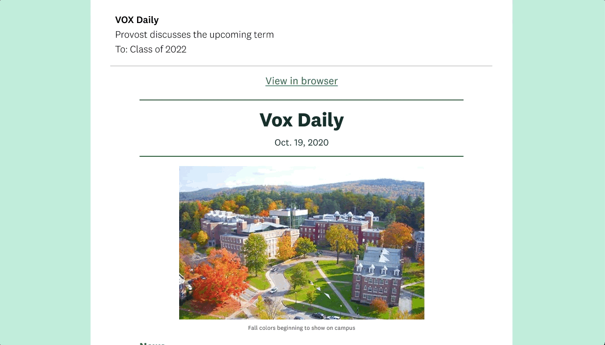
The original Vox Daily email, web portal, and submission system.
User Research Insights
The ITC team wanted our team to start from scratch, limiting our ability to even see the current state of the system. My design partner and I conducted 8 user interviews with faculty and staff members, and received 194 survey responses, consisting of 102 staff, 16 faculty, and 86 students to better understand their needs.
1. We have three different user groups
The Vox submitters consist of faculty and staff that usually post an announcement or about an event. Moderators are the Office of Communications staff who edit, approve, or reject submissions and compile the daily order of news, announcements, and events. Vox readers are any faculty, staff, and students in the Dartmouth system.

2. Users found Vox Daily to be a great resource for information, but found it hard to engage with.
Our survey results showed that 64.4% of survey respondents read Vox every day and 12% of survey respondents read Vox 2-3 times a week, a percentage that was higher than we expected. There is a lot of valuable information in Vox Daily, but they wrote in the comments that the lack of stylization makes it hard to quickly skim for the information relevant to the user.
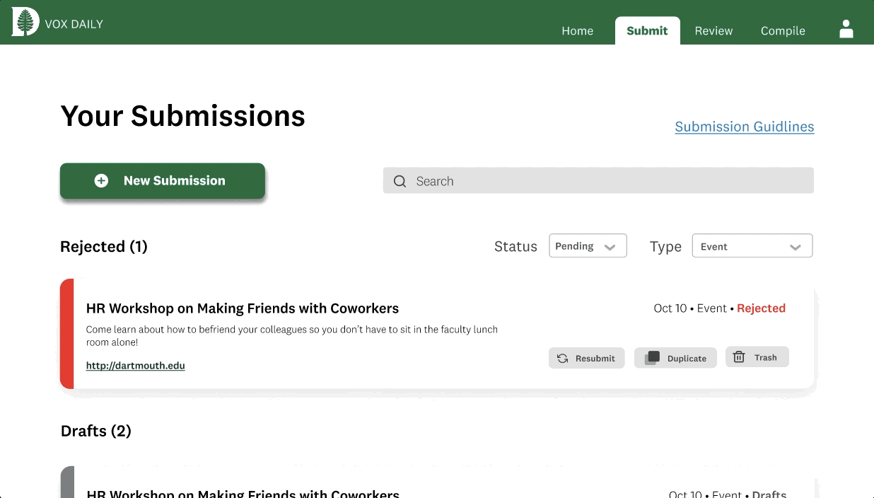
3. Not only is the design outdated, but the submission process is an unintuitive and time-intensive process.
The content submission process had frustrating character count limits and submission restrictions, limiting when and how submissions were made. Many users explained that they create their submissions in a document outside of the platform and copy over the content every time since the platform was unreliable and couldn’t store previous submissions.

Key insights from our empathy maps.
We synthesized our user research through empathy maps, personas, and journey maps to identify our users’ pain points and opportunities for improvement. The two personas we created were the frustrated faculty submitter and unengaged Vox reader.


Key pain points
Readers are unable to quickly skim the headlines and find relevant content.
Submitters could not submit content more than a month in advance.
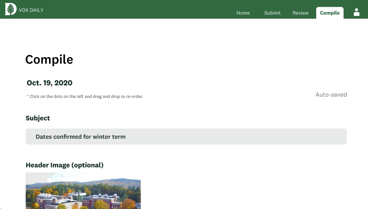
Moderators can not easily reorganize the order of news, announcements, and events for the daily digest.

Hierarchical Design
Many of our design decisions ultimately came down to improving hierarchy. We wanted to structure all of the pages in a way that users can quickly browse the daily digest and the management system and find what they are looking for.
How do we make Vox Daily skimmable?
In our user research, readers often expressed how they wanted to be able to skim the headlines and find the information that peaked their interest. Taking inspiration from the NYT Daily Briefing and the Skimm, we created a clean, structural layout breaking up the sections with headers that were green in color, had larger font sizes, and thicker line weights. Here is a snapshot into the evolution of the designs from initial sketches to hi-fi mockups.

Filtering through the left navigation bar vs. a standard filtering method
Originally, we thought our main task was going to be stylizing the email and web view of Vox Daily, but we quickly realized the major pain points from our users extended far beyond the email. We went back and forth multiple times on whether the navigation bar should be on the side on the top, which depended on how we wanted to filter content. One challenge was finding a way to categorize and filter submission types while keeping the design simple and easy to use. Ultimately, through iteration and feedback from other designers, I decided on a top navigation bar menu since we didn’t have that many pages, and opted for two filters: status and type of submission.

A few iterations of the different filter layouts and styles we tested.

I iterated on placing filters in a side navigation bar versus having a standard drop down or tag filter method. Our final design was a top navigation with two filters shown in the screen on the right.
Vox Daily Redesigned - The Final Prototype
We concluded the 10-week term with a student, staff, and faculty-facing website as well as an initial email design. Our developers were able to create our designs into a working website version, but the email styling had not been addressed yet. Here is a walkthrough of the final prototype:


Reflections
Our team started this project from square one, rethinking the possible framework and structure of the Vox Daily system.
I learned how to redesign an existing platform from scratch, rethinking the curation and delivery of information-rich content every single day to all Dartmouth affiliated people.
I practiced rearranging the structure of the website multiple times at various stages in the project as new features and considerations arose, restructuring the navigation bar and filters throughout the process.
I grew my confidence in communicating with various stakeholders, including the Dartmouth ITC group, the Office of Communications staff, other faculty and staff, and students, which often had conflicting needs or points of view.
Next Steps
In the second term of this project, the team will be tasked with adjusting the existing email design to work within the constraints of the new mail delivery system Dartmouth ITC and the Office of Communication agrees upon. Further styling adjustments and user testing are needed in order to improve the user experience for all three user groups.
